

3.2.6. Performance Plots
Model Performance Plots show the relationship between the observed and predicted values of the dependent variable. They are launched by clicking on a cell in the Model Performance Grid. The Plot type initially posted is a Scatter plot (1), which is different for classification and regression models. Scatter plots are the only option for MLR regression models and for SVM classification models, but Confidence Analysis is enabled for ANNE classification models and Uncertainty Analysis is enabled for ANNE, SVM, and KPLS regression models.
Scatter (XY) plots
The plot title indicates the ensemble architecture represented by each plot and summary statistics are listed at the bottom of each plot.
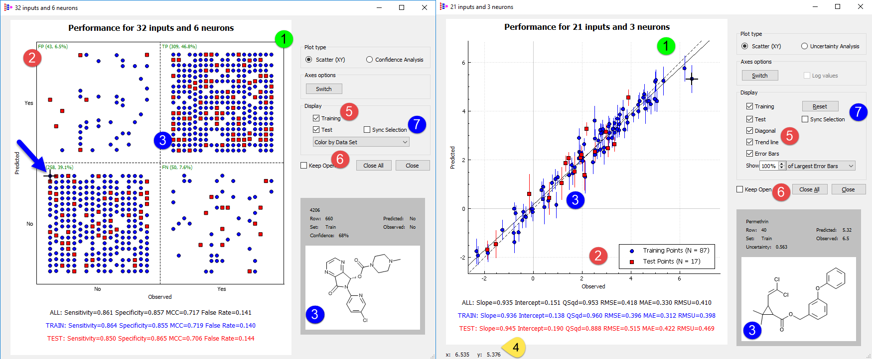
The plot for the 32x6 ANNE classification model shown above includes a graphical two-way truth table, with observed positives in the right-hand cells and observed negatives in the left-hand cells. Predicted negatives, on the other hand, are in the upper cells and predicted positives are in the lower cells, which puts false negatives in the lower right-hand quadrant. The number and fraction of each class - false negatives (FN), true positives (TP), true negatives (TN) and false positives (FP) - are indicated in the top left corner of the respective quadrants (2). Training pool points are colored blue, whereas test set points are highlighted in red. The point coordinates in the truth table are determined by the class to which they belong and to the order in which they were originally input. As a result, each point that appears in the lower left (true negative) quadrant leaves a matching hole in the lower right (false negative) quadrant.
XY performance plots for regression models show predicted vs observed values. The distribution of compounds between the training pool and test set are indicated in the legend (2) for regression models such as that shown above for a 21 input x 3 neuron ANNE regression model.
Clicking on a data point on either graph selects that point (3) and displays the corresponding molecular structure in the box at the lower right corner of the dialog, along with some additional information about the data point. This feature is useful for identifying outliers and influential compounds in a data set. Simply hovering over a position in the graph, on the other hand, will display the corresponding X and Y coordinates (4).
Clicking on the Switch button in the Axes options field (5) interchanges the predicted and observed axes in plots for either kind of model. The Display options allow you to toggle display of the test set and training pool points and, in the case of regression models, to control display of the Trend line and/or the 1:1 Diagonal, which would correspond to perfect predictions. Note that the trend line shown reflects the least-squares linear fit to the displayed data points - Training, Test or both.
You can launch multiple Model Performance Plots for any given Model Performance Grid. The Close button (6) will close the plot window in which it resides, whereas clicking on the Close All button will close all open plots in which the Keep Open option is not checked. Keeping a particularly good model open for comparison is useful when considering alternative architectures.
If Sync Selection (7) is checked on for a plot, clicking a point in that plot will cause the same point to be selected in all open plots in which that point is displayed.
Error bars
Checking on the Error Bars option for regression models will turn on the display of error bars for each data point. The distance of the line from the model prediction is equal to the uncertainty estimate, so the overall length equals the +/- uncertainty estimate for each point. If the predictive error follows a normal distribution and is unbiased (i.e., has a mean of 0), then the true value is expected to lie within the range covered by the error bars about 68% of the time. A prediction's uncertainty estimate will be included in the lower right section of the dialog when you click on a point when uncertainty information is available.
Which error bars are displayed can be controlled using the Show nn% of Largest/Smallest Error Bars widget below the Error Bars checkbox. For example, selecting Show 10% of Largest Error Bars will suppress display of all but the largest 10% of the error bars: if 90% of the uncertainty values were below 0.5 and 10% were above 0.5, then the error bars would only be shown for the points with uncertainty values above 0.5. Similarly, selecting Show 10% of Smallest Error Bars would turn off display of all but the smallest error bars. This does not affect which points are displayed. These options may be useful for identifying molecules with predictions associated with relatively low or high confidence predictions. If the model does not have an underlying uncertainty model, then the Error Bars and Show… options will be grayed out/disabled.
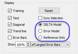
If you have built a DELTA Model by specifying a reference variable in the Variable Selection dialog, three additional options will appear in this field. These allow you to toggle the plot display to see how well the input response data fits the full DELTA Model; how well the deviation from the reference variable is accounted for (Error Model); or how well the raw input data fits the reference variable itself (Reference Only).
The truth table is more complicated for multiclass models, as is illustrated below. A model was built on human microsomal clearance data split into three classes (Low, Medium and Too_High) using thresholds of 20 and 60 μL/min/mg HLM protein.
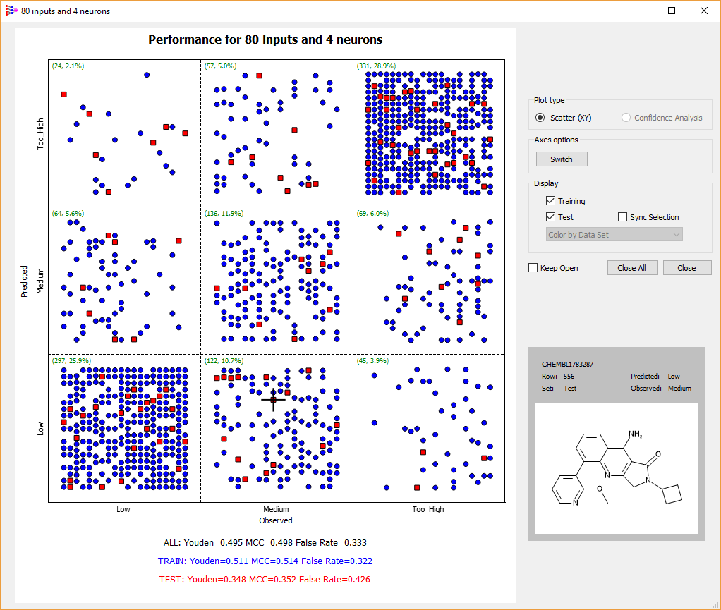
In some cases, introducing such a boundary class can improve classification performance at the high and low ends by setting aside observations too near the threshold; it does not do so in this case.
Uncertainty Analysis plots
Toggling the Plot Type for ANNE, SVM, or KPLS regression models to Uncertainty Analysis produces cumulative distribution plots of ensemble Squared Error as a function of the standard deviation of the individual submodel predictions.
The Display section of the dialog allows you to choose whether to display the Cumulative Distribution of the Squared Error for the Training or Test sets by checking the appropriate boxes. A second kind of cumulative distribution may be displayed by checking the Standard Deviation box ON. Doing so displays the cumulative distributions for the ensemble standard deviation itself. In this case, the distribution shows the fraction of points having a standard deviation less than or equal to the given value so the formula used to calculate it is somewhat different than for the Squared Error.
The display conventions for each plot are shown in its legend. Solid red and blue lines represent the training set cumulative squared error and standard deviation graphs, respectively. Similarly, red and blue points show the distribution of the test set. Finally, dashed red and blue lines show graphs of the fitted cumulative squared error and standard deviation from the uncertainty model. These lines are labeled as the “predicted” results.
Points in the lower left part of the plot have the lowest uncertainty estimate. Similarly, points at the upper right have the largest uncertainties. Selecting such a point and comparing its uncertainty to a point in the lower left corner will show the range of uncertainty estimates across the entire data set. The plot may be translated by dragging the mouse across the plot with the left button depressed. It may be zoomed in or out by moving the mouse wheel while the cursor in located in the plot region. Clicking the Reset button restores the plot to its initial zoom setting. Also, note that when a point is selected while showing the Cumulative Distributions plot, it remains selected when switching to the Scatter plot or the Q-Q plot.
Q-Q plots
Quantile-quantile (Q-Q) plots provide a way to visualize how similar two distributions are. When one is a fitted or purely theoretical reference distribution and the other is an observed distribution, they are analogous to predicted vs. observed plots. Points for distributions that are similar lie near the diagonal.
Q-Q plots may be shown for the Squared Error or Standard Deviation distributions by selecting the corresponding radial button under the Display menu box. However, only one Q-Q plot can be shown at a time to avoid confusion. Display of points corresponding to the training set (blue) or test set (red) can be toggled on and off using the corresponding check boxes in the Display menu box. The dashed diagonal line represents a perfect fit; it is always displayed.
The third kind of Q-Q plot that can be displayed is for the Normalized Error. It is obtained by taking the observed absolute error for each data point and dividing (normalizing) it by its uncertainty estimate. If the uncertainties are accurate estimates of the standard deviations of the errors, then the normalized errors are expected to follow a standard normal distribution with zero mean and unit variance. We opted to plot this in terms of the unsigned error instead of signed error, which corresponds to using the folded standard normal distribution as our reference distribution.
The more closely the points follow the diagonal line, the better the results support the inference that the normalized error follows a standard normal distribution. This is important for making statistical inference and constructing confidence intervals. If the errors across the entire data set are normally distributed, then we would expect that ~68% (corresponding to plus or minus one standard deviation) of the points would have an observed error less than or equal to the observed overall RMSE (root-mean squared error). Having an individual uncertainty estimate allows for a similar interpretation for each prediction. When the normalized error is normally distributed (as indicated by the Q-Q plot for Normalized Error), then the error for a given prediction is expected to be within the uncertainty estimate ~68% of the time.
This complements comparing the overall RMSU (root mean squared uncertainty) to the RMSE. As explained elsewhere, the uncertainty model is obtained by fitting the training set’s cumulative distributions of squared error and ensemble standard deviations to generalized gamma distributions. A good match between RMSE and RMSU for the test set is evidence of a good uncertainty model overall and may aid in selecting the best model from the performance grid.
Confidence Analysis (CFA) plots
Toggling the Plot Type for ANNE classification models to Confidence Analysis produces a plot of observed and predicted error rates as a function of the degree of concordance between the individual models that make up the ensemble, i.e., as a function of the tally of "positive" votes across networks in the ensemble. The example shown at left below is taken from a CYP 3A4 inhibition classification model built using the voting method. The classification threshold is indicated by the vertical dotted line.
Predictions to the left of the threshold represent negative predictions and those to the right of the threshold represent positive predictions. Errors to the left of the threshold represent false negatives, whereas those to the right represent false positives. The example shown below is for the sort of split beta binomial error model typically obtained for an unbalanced dataset. The maximum uncertainty for the profile (1) is displayed at the bottom of the plot (2). The uncertainty value at which the predicted uncertainty profile (the black dashed line) intersects the threshold (3) is informative, as are the points at which the uncertainty profile intersects the Y axes. The latter indicate the limiting predictive uncertainties when the network predictions are in unanimous agreement: all votes are positive votes or no votes are positive. The majority class is often "learned" better than the minority class, so the intersection for the minority class (negatives, in this example: 4) is more informative about the usefulness of a particular confidence model.
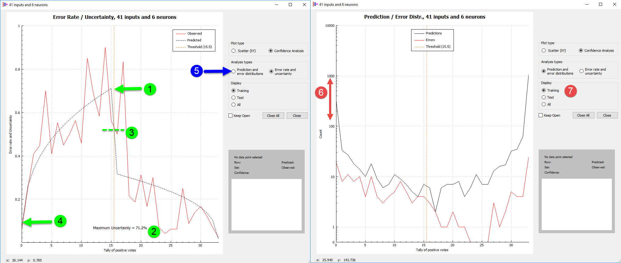
The Confidence Analysis (CFA) plot supports another, complementary view of the data as well. Clicking on the Prediction and error distributions button (5) switches over to a view of the underlying distributions (above right). Here the y axis is logarithmic (6) because, as is typically the case, nearly all networks agree that a given compound is a negative (0-3 positive votes) or that it is a positive (31-33 positive votes). There are fewer than 20 predictions in the intermediate vote tally (4-30 positive votes) with six or fewer errors in any of those bins.
Examination of these curves puts their ratio (shown at left) in perspective: there were 1603 observations in all, 85% of which (1361) were in the training pool that is displayed by default (7). Hence each individual point in the intermediate tally range represents at most 0.4% of the data set.
Most of the errors in this model are false negatives that lie in the high-confidence negative prediction zone where the positive vote tally is 3 or less. Indeed, the minimum uncertainty for negative predictions is 0.20 (20%; 6 above left). Investigation of data points for which the estimated confidence is high but the predicted classification disagrees with the input classification often shows that they were miscategorized in the first place. For CYP metabolism, this may mean that the compounds in question have not yet been thoroughly enough investigated to be sure that they are in fact not substrates.
Split vs unified error CFA plots
Typically, unbalanced data sets like the one shown above call for beta binomials to be fit to the positive and negative predictions separately. The discontinuity at the decision threshold is characteristic of such split error models. Its presence almost always means that the maximum uncertainty will be greater than 0.5 and, conversely, that the minimum confidence will be less than 50%. Balanced data sets, on the other hand, can often be fit well by a single, unified error distribution. Separate error distributions may still be required when the numbers in each class or the information content of the classes differ significantly, but - other things being equal - a unified error model is to be preferred for a balanced data set. Split error models may be necessary to get balanced overall performance statistics across classes, e.g., to get a high enough sensitivity when there are many fewer positives than negatives.
In any event, the optimal uncertainty profile is one which crosses the classification threshold at 0.50 (3) (see Clark et al. (2014) for a detailed explanation of this point). The CFA plots shown below are for the balanced data set described in the section on the Min Confidence metric in Performance Grids. It shows CFA plots for three of the best logP classification ANNEs obtained for that data set, numbered as in the corresponding figure from that section.
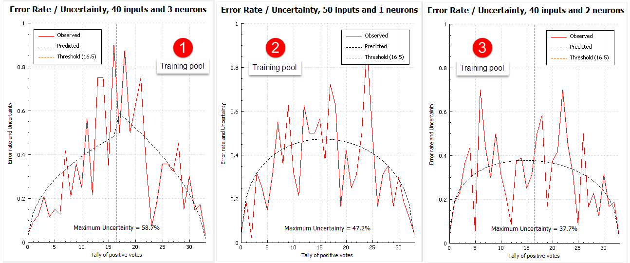
These plots are for the respective training sets. In this particular case, we held back about 90% of the data to serve as a test set specifically to see how well the error models performed. The Test set Display option in the Confidence Analysis dialog was clicked ON to generate the figure below. The error distributions for the test sets are show by the red lines, whereas the predicted uncertainty profiles fit to the training pool are shown by the dashed black lines. The profile predicted from the training pool for the 50x1 model best fits its observed test set error (5 vs 4 and 6). The noisier distribution of observed uncertainties for the 40x3 and 40x2 training pools (1 and 3 above, respectively) makes it hard for the program to choose between unified and split uncertainty profiles.
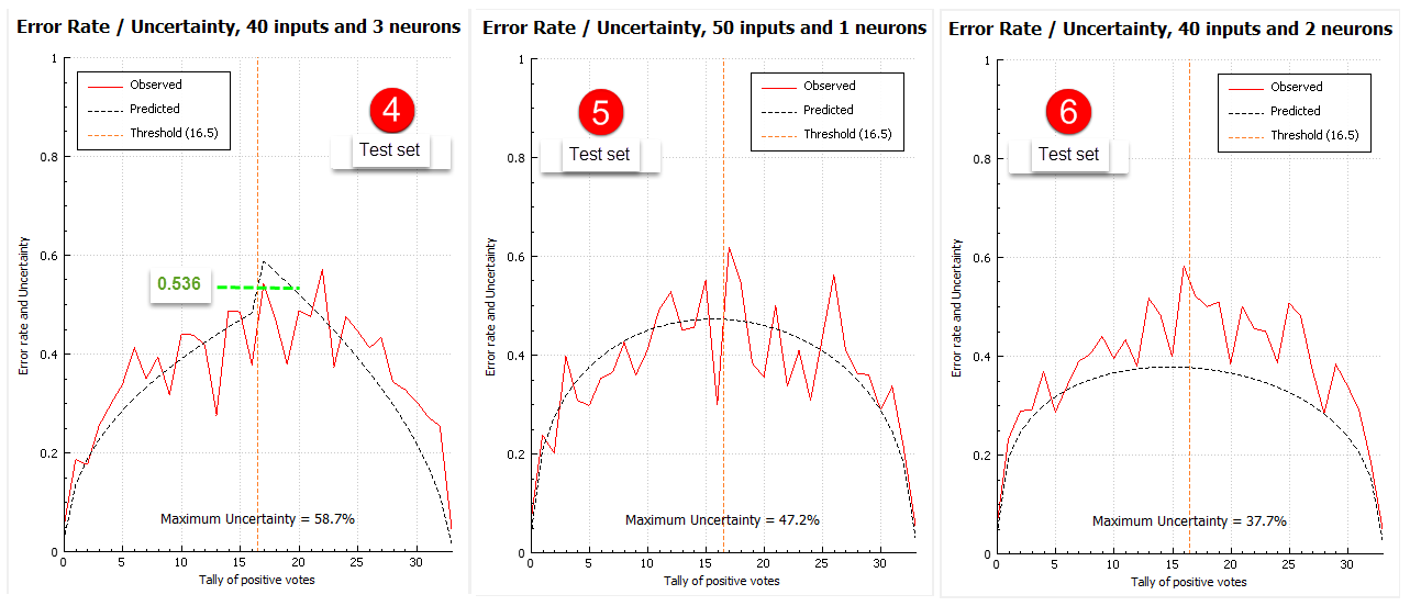
Our experience using such large external test sets indicates that unified error profiles for which the uncertainty peak lies below 45% (e.g., 3) consistently overestimate confidence and that any CFA whose cross-over value (as opposed to the maximum uncertainty or minimum confidence) lies outside of the 0.45-0.55 uncertainty range is suspect regardless of which class of error model it falls into.
If a strong reason exists to prefer a particular architecture that has a sub-par confidence model but good performance statistics otherwise, try rebuilding the model using different random number seeds. This can be expected to produce a usable error model if the ANNE model itself is robust.