

1.12.3. 2D Scatter Plots
2D scatter plots are used to show the relationship between pairs of attributes; a third attribute can be used to determine point color. To change the axis and color variables, click on the Modify chart icon at the left end of the chart toolbar.
The image below shows an example of a plot in which the color axis has been assigned to [ADMET_Risk]. The fact that the circled compounds have higher Risk values is indicated by the red coloring; the color convention has been reversed. The linear-fit toolbar button was used to fit a straight line to the data, with the results summarized at the top of the plot.
Hovering the mouse over any point within the plot provides the chemical structure and associated properties of the compounds, as illustrated below.
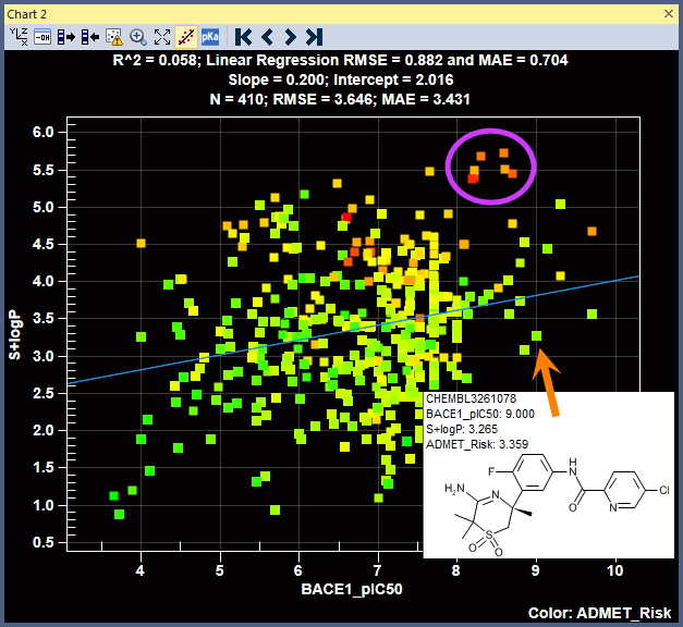
Points in the plot can be selected by clicking and dragging the mouse. The points selected as a result will be highlighted in black. There are two transfer icons on the toolbar (third and fourth from the left). They let you synchronize the spreadsheet selection with the chart selection: clicking on the left icon updates the chart using the spreadsheet, whereas clicking on the right icon updates the spreadsheet to match what is selected in the chart.
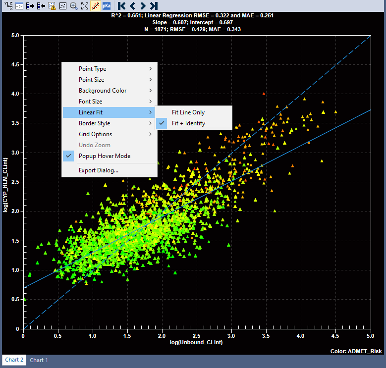
When clicked, the linear-fit toolbar button, fits a straight line to the data, with the results summarized at the top of the plot. The scatter plot shows two lines one of the represents fit line and other dotted line represents line of identity. The user can turn off the line of unity by right click within the plot area and turning off the Linear Fit >> Fit + Identity menu. All the plots, in the manual, have been prepared by turning off the line of identity.