

1.12.5. Confusion Matrix
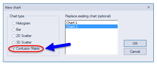
ADMET Predictor allows you to plot selected data in a confusion matrix analogous to the classification-model performance plots available in ADMET Modeler. Basically, it is a kind of two-dimensional histogram that supports point-picking; it is useful for assessing the performance of an old classification model on new data. DATA >> Add New Chart launches the New chart dialog, which includes Confusion matrix as an option. You can also indicate whether you want to Replace an existing chart, as has been done in the screen capture shown below.
Clicking OK attaches a new chart to the spreadsheet. Clicking on the XYZ icon at the top left corner of the new plot window (arrow) displays a Modify chart dialog tailored to this chart type. Just as for 2D scatter charts, you can set the X- and Y-axis attributes (1 and 2 below, respectively) and color-code the points (3). You can also control which class is identified as the "negative" class (4) and adjust the color scaling (5).
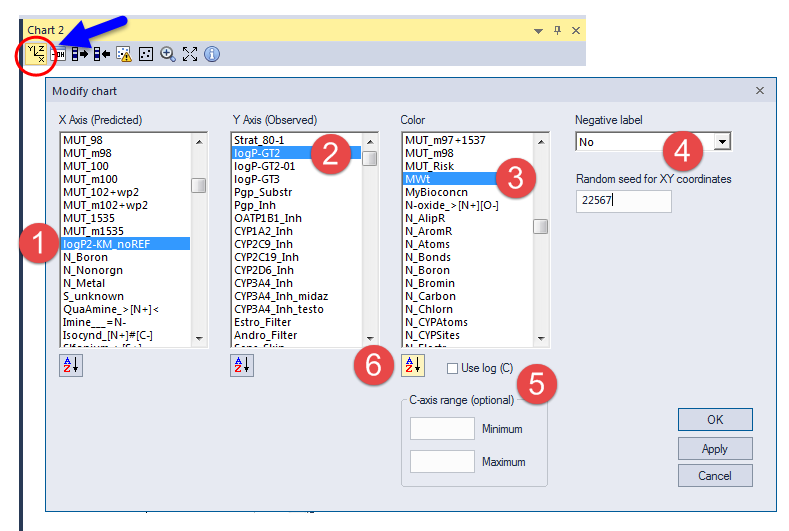
The Negative label you select is used in calculating the sensitivity - (TP/(TP+FN) - and specificity - TN/(TN+FP) - statistics shown at the top of the confusion matrix plot shown below. The false rate is given by (FN+FP)/(TP+FN+TN+FN). Please see the Modeler section of this manual for a discussion of the MCC and Youden's index.
Here "T" and "F" indicate true and false predictions, respectively, and "P" and "N" indicate positive and negative predictions, respectively.
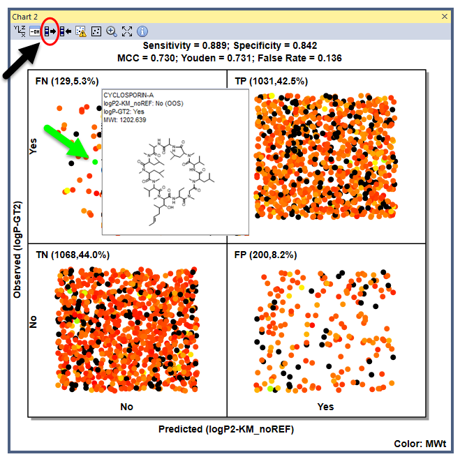
These data are for a small-scale logP classification model used to test our confidence estimation software; it bears no relation to any commercial model. The black points in the chart correspond to the rows used to build the model; they were highlighted by selecting rows in the spreadsheet, then clicking on the third icon on the chart toolbar (black arrow). The other points are from the external test set.
Hovering over a point (e.g., the green point in the false negative quadrant) pops up the corresponding structure and its attribute values. Given the relatively small size of the data set used here, it is not surprising that cyclosporin A (experimental logP = 2.92) was mispredicted as having a log P \< 2. It is reassuring that it was flagged as being out-of-scope.
It can also be very useful to color-code points by their confidence level to show graphically how many of the false positives and false negatives are boderline in confidence. Doing so also provides some sense of how well the confidence estimates mirror the observed distributions.