

1.12.2. Bar charts
In bar charts, the X variable is categorical: each unique value represents a class and each class is represented by a separate bar. The attribute used for the Y axis, in contrast, is numeric. The height of each bar then equals the average value of the variable over all compounds in the class represented by the bar.
Clicking on a bar in a bar chart launches the Compound attributes window, which lets you view the compounds in that class along with their attributes.
When two-color display mode is activated by clicking on the Two-color chart icon near the left end of the toolbar, two sets of bars will be displayed (see below): a blue set corresponding to the spreadsheet rows that were not selected when the chart was created and a red set corresponding to the selected rows. This is a convenient way to compare and contrast the property distributions of the two subsets. Note that the icon is highlighted when the chart is in the two-color display mode.
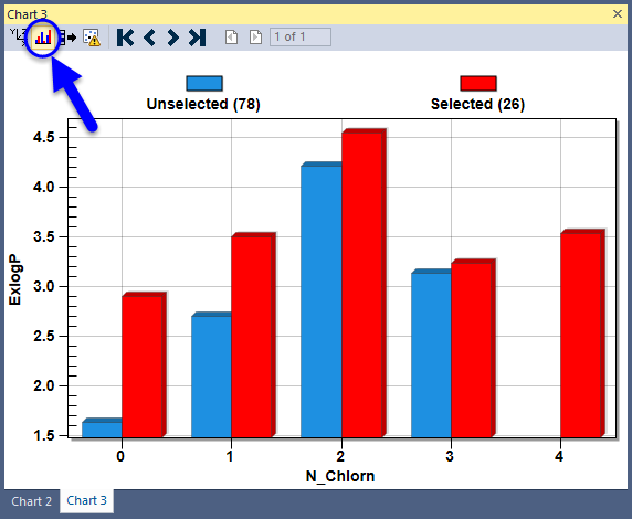
The plot does not update automatically if two-color display mode is active when the spreadsheet row selection is changed. You can, however, update the chart to reflect the current row selection by clicking on the Update Chart using Spreadsheet icon just to the right of the Two color display icon in the toolbar.