

1.12.4. 3D Scatter Plots
3D scatter plots show the relationship between three attributes. A fourth variable attribute can be specified for determining color. To change the axis and color variables, use the Modify chart icon at the left end of the toolbar at upper-left corner of the window.
3D scatter plots can be:
-
XY-translated with the left mouse button.
-
scaled (zoomed in or out) using the mouse wheel or by holding down the left and right mouse buttons simultaneously.
-
rotated with the right mouse button.
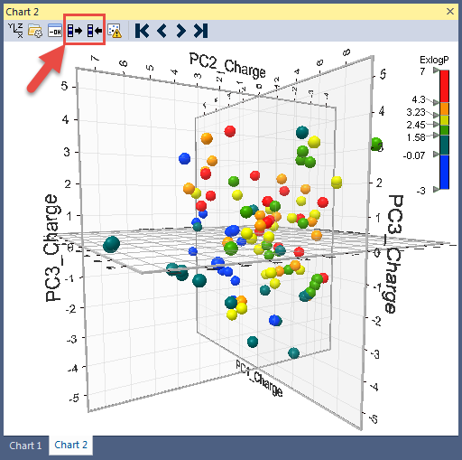
Points in the plot can be selected by clicking and dragging the mouse. The points selected as a result will be highlighted in black. There are two transfer icons on the toolbar (third and fourth from the left). They let you synchronize the spreadsheet selection with the chart selection: clicking on the the left icon updates the chart using the spreadsheet, whereas clicking on the right icon updates the spreadsheet to match what is selected in the chart.