

1.12. Plotting Data
ADMET Predictor provides a variety of charting motifs for visualizing numerical and text attributes and their interrelationships. By default, the main window displays a histogram and a 2D scatter plot. Additional charts can be added using the menu item DATA>>Add Chart or by clicking on the corresponding toolbar icon:

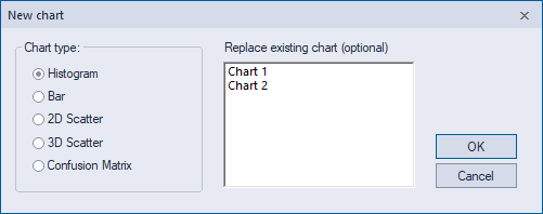
Either approach launches the New chart dialog, where you specify which chart type you want to create: Histogram, Bar, 2D Scatter, 3D Scatter or Confusion matrix. The default behavior is to add a new chart of the specified type to those already present. To replace an existing chart instead, select the chart you wish to replace from the Replace existing chart.... list. Clicking on OK will carry out the chosen action.
Toolbars
Every chart has its own toolbar, which will include several of the icons laid out below:

(1) Modify chart launches the Modify chart dialog, which allows you to change axis variables, toggle axes between linear and log scales and set axis minima and maxima.
(2) Popup selection displays selected points (compounds) in a separate popup window. This icon appears only in scatter plot toolbars but the same popup window is displayed when you click on a bar in a histogram or bar chart.
(3) Update Chart from spreadsheet selection selects selected points in scatter plots to correspond to those for rows currently selected in the spreadsheet. For histogram and bar charts, it updates the row selection in two-color mode (see below) to match rows currently selected in the spreadsheet.
(4) Update Spreadsheet from Chart selection resets the row selection in the spreadsheet to match points currently selected in the chart. This icon appears only in scatter plot toolbars.
(5) Display out-of-scope information identifies compounds that are out-of-scope for one or more of the properties currently displayed in a chart. For histogram and bar charts, out-of-scope compounds are displayed in two-color mode (see below). For scatter plots, out-of-scope compounds are selected and highlighted in black.
(6) Zoom mode enables or disables the zoom mode in 2D scatter plots. When zoom mode is active, clicking and dragging the mouse within the chart will zoom the are you select. When zoom mode is not active, dragging the mouse will result in point selection. In histogram and bar charts, dragging the mouse will always zoom the display, so no icon is necessary. In 3D scatter plots, zooming is achieved using either the mouse wheel or the combination of left and right mouse buttons.
(7) Unzoom restores the full default display area. The icon appears only in 2D scatter plot toolbars. For histogram and bar charts, this effect is achieved by right clicking inside the chart and selecting Undo Zoom.
(8) Linear Fit creates and displays a least-squares fit line to the displayed data points in 2D scatter plots and shows the degree-of-fit statistics (RMSE, MAE, R2, etc.). The linear regression RMSE and MAE correspond to deviations from the regression line. The second set of statistics are calculated from direct comparisons between individual X and Y values. They are only meaningful when the units or scales of X and Y are the same.
(9) pKa plots predicted pKa against observed pKa in 2D scatter plots. Observed pKa values need to have been loaded for this to work.
(10) Navigation Arrows can be used to change the attribute used for each axis. The X axis changes if you simply click on an arrow. To change the Y axis, hold down the Ctrl key while clicking. To change the Z attribute in 3D charts, hold down Shift while clicking on an arrow.
If the Alt key is held down, navigation will be among only those attributes currently displayed in the spreadsheet. Otherwise it shifts among all attributes.
(11) Toggle two-color display mode toggles between one- and two-color display modes in histogram and bar charts. The two-color display mode has a red set of bars that represent data from the rows selected in the spreadsheet when the mode is entered and a blue set of bars representing data from those unhidden spreadsheet rows that are not selected. This is a convenient way to compare the property distributions of two distinct compound subsets.
By default, a second Y axis is displayed at the right of the graph for the selected bars. This is convenient when the selected and unselected sets are very different in size and can be toggled OFF in the Modify chart dialog launched by icon (1).
(12) Load Template is used to change the plot style (color, axes, etc) in 3D scatter plots. Four different 3D scatter plot-templates are provided in your ADMET Predictor application data folder, including plain white, plain black, lattice white and lattice black.
(13) Page Navigation controls become active when the histogram displays text values and the number of unique text values is larger than the allowed number of histogram bins per page (32 is the default). These controls allow you to scroll through the available pages. See the Histograms section for additional information.
This chapter includes sections that provide further details for: